
A comprehensive walkthrough of starting, building & selling my first startup
Founder
UX Research
Strategy
Prototyping
Pitching
Brand Guidelines
Pitch Decks
Leadership
User Testing
UX/UI
Design System
Creative Direction

ABOUT THE COMPANY
Gofyt - Book a health & fitness professional anywhere
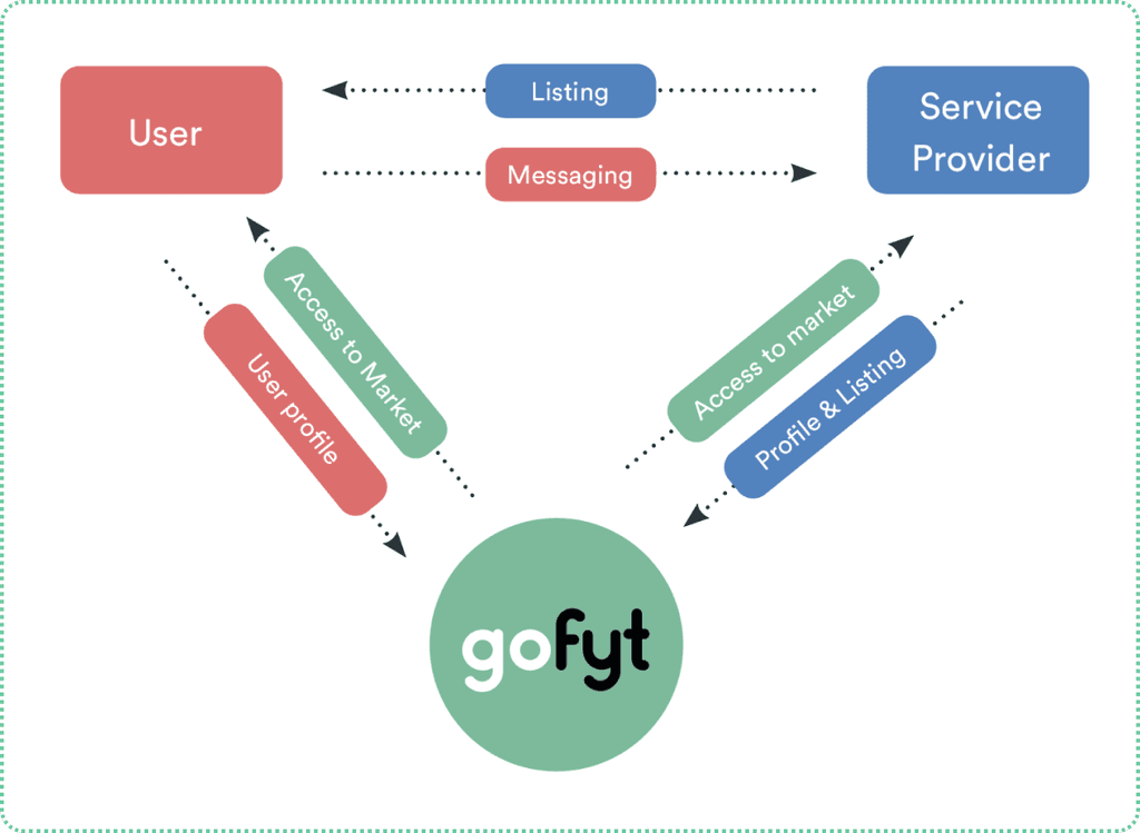
gofyt is an online marketplace that helps anyone anywhere find and book a health and fitness professional and enables the health and fitness professional to easily manage all aspects of their business.
Think Airbnb for the health and fitness industry. It was an amazing experience to take this from an idea to acquisition.
About the company
Gofyt was born when fellow co-founders Timmy (business strategy) Jason (Sales/Marketing) who both compete internationally in 400m and 400m hurdles for Ireland Athletics discovered it was extremely problematic and time consuming to find a health & fitness provider at home and on the go to and from events.
From Physiotherapists to Nutritionists, from coaches to phycologists, they found it incredibly challenging to find a service provider that was available, affordable and locatable.

SUMMARY
Problem
Health & fitness service providers worldwide have the same problems - They are juggling a ton of different platforms to run their businesses, no-shows are killing their top line revenue and they have no idea how market & scale their business.
The everyday person who needs a health & fitness professional has no idea where to look to find a good one and no idea how to book.
Goal
Build & scale and health & fitness marketplace, secure partnerships with governing bodies in the regulated space. Grow to 10,000 bookings. Aim to get a monopoly in Ireland.
- Design Management (sprint planning and weekly reviews)
- Brand guidelines
- Pitch decks
- Design system
- End-to-end product redesign
- Website design
- UX analysis (flows and persona)
- Usability Efficiency (Heuristic Reviews)
- Lo-fi prototyping (basic flow and interactions)
The Outcome
I came on board as head of design to create the mobile and web experience from scratch. We launched a buggy MVP that didn’t work but generated substantial interest. From there were grinded for years and slowly but surely made progress.
gofyt was acquired by legitfit in july 2021
At the time the company had grown to the following:
7000+ users
200+ listings
5 partnerships with governing bodies
10,000+ bookings
10,000+ social following
10,000+ hits per month on the site
Won 2 startup awards
100K+ in revenue
Team grew to 10+
Secured a seed round
DETAILS
Deeply understanding the problems
A key part in the process in having the winning formula is the key domain experience we had on team in Timmy and Jason. They lived and breathed the industry, they had the network, the contracts, the accolades by representing our country at it’s highest level on it’s biggest stage.
Needless to say this got us in many doors and initiated key conversations which led to our first customers. Their access to their own pool of health and wellness service providers made it extremely easy to get meetings / conversations.
Within a matter of days we gained valuable first hand insight into the day to day problems of running a service, I used this key information to structure user journeys and create personas and beacons to direct the user experience of the platform.

Working out the flow
At this stage its critical to understand frustrations, discover insight and the positives and negatives about starting and running a health and fitness service. Gathering research on the user and common problems they face.
Carrying out market research with industry leaders was vital, understanding common themes and trends validated the approach we took, it’s also important to work quick but work smart iterating as you go.

Prototyping
I learned early in my career to get results quicker it is best to get to the ‘on screen’ design stage as soon as possible (XD, Sketch, Figma AI, PSD, InD). Using basic paper prototyping to understand rough layouts and processes of different actions on the mobile experience are key at this point.
I have never seen the benefit of exhaustive paper prototyping. Going through every page with multiple iterations without being on screen is a major disadvantage for a number of reasons:
Challenges with exhaustive proptyping
It goes against your timeline, when there is a runway of finances in a startup, deadlines to be hit, users to test, everything must stay as lean as possible.
Designs change, no matter how accurate they seem to be on paper, on screen is a different ball game, every design change is also much easier to make on screen than on paper.
You learn to be more efficient, training your mind not to go above and beyond what it needed, but maintaining the mindset of hitting exactly what is needed for the project to progress and succeed.
The most efficient process

From this point on each user journey was wrapped in a short sprint to sketch and wireframe key user journeys and core functionality.
Prototyping software like Adobe XD and Sketch allows useful features like linking screens and transitions. Starting with understanding main needs and requirements of the two main user types informed the navigation types which in this case needed to be different to meet all user requirements.
It is very satisfying as a designer to go through this process and see an idea become an tangible interactive screen.
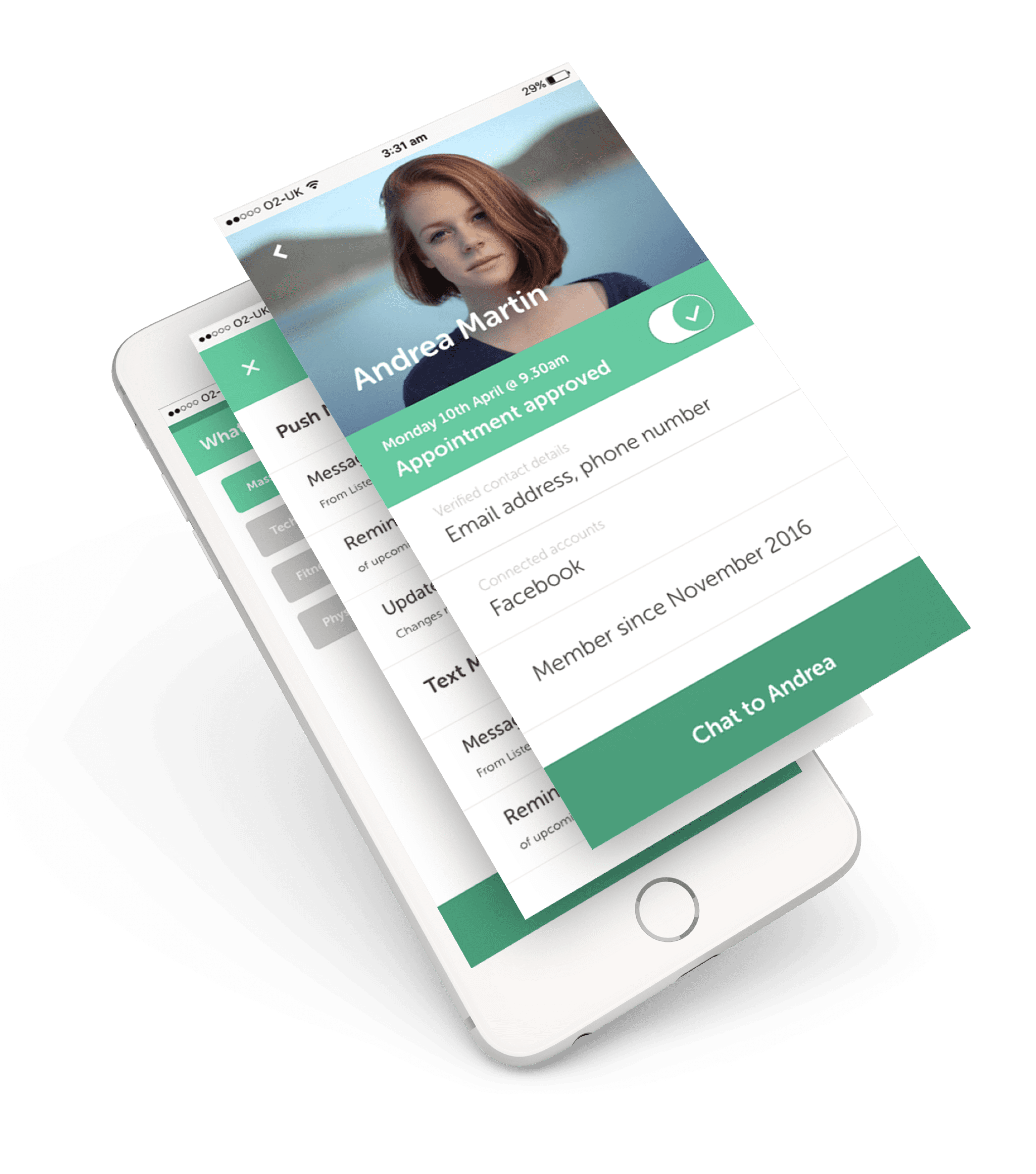
Bridging the gap with great user experience
Key service provider functions (Seller)
Simple listing management
Intuitive calendar & planner
Safe payment gateway
Get paid upfront for booking
Easily accept or deny appointments
Manage multiple listings
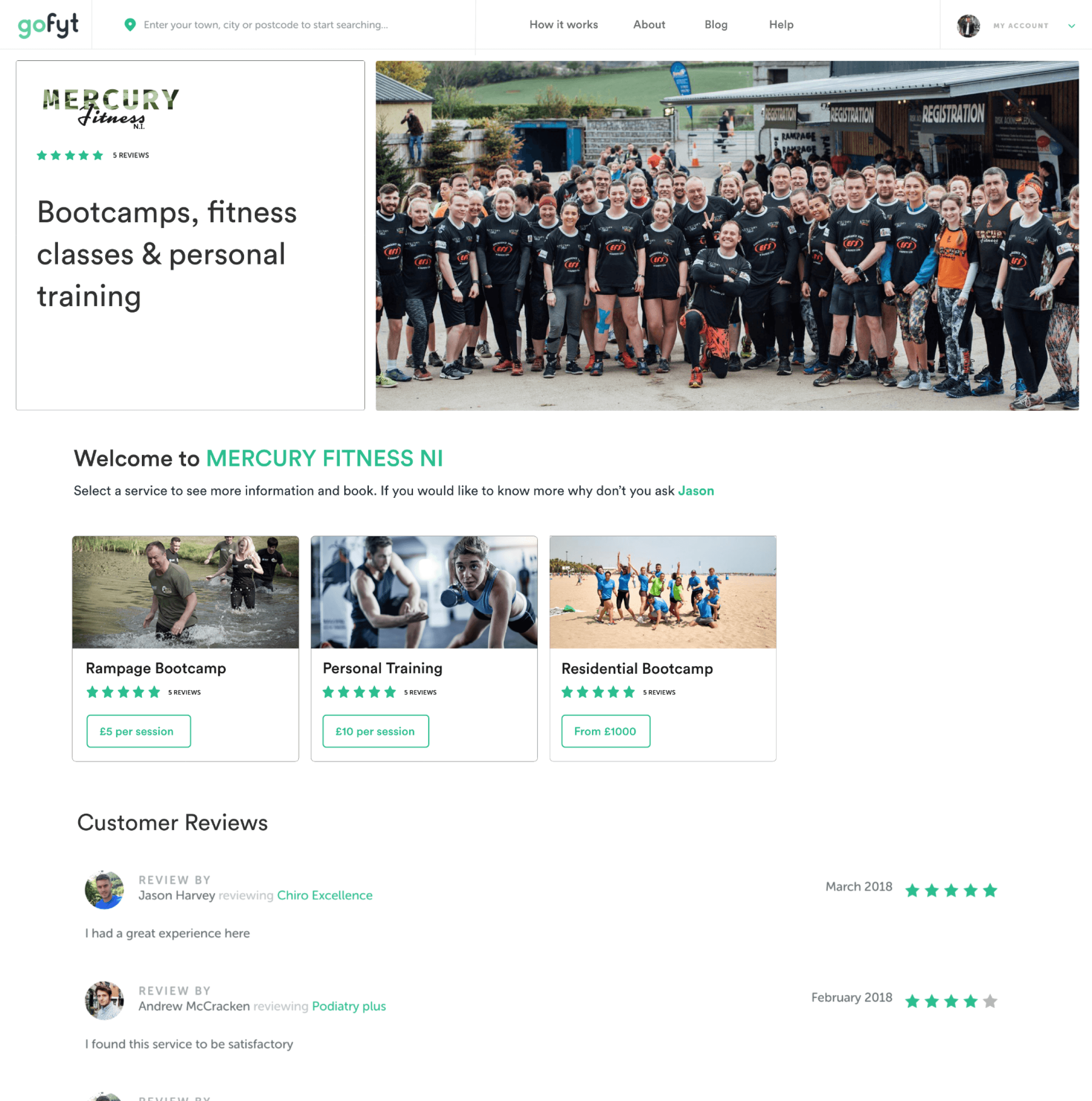
Key End User functions (Buyer)
Search by category and location
See featured listings near you
Extensive categories covered
See pricing
See availability
Simple booking system

Delivering across the board
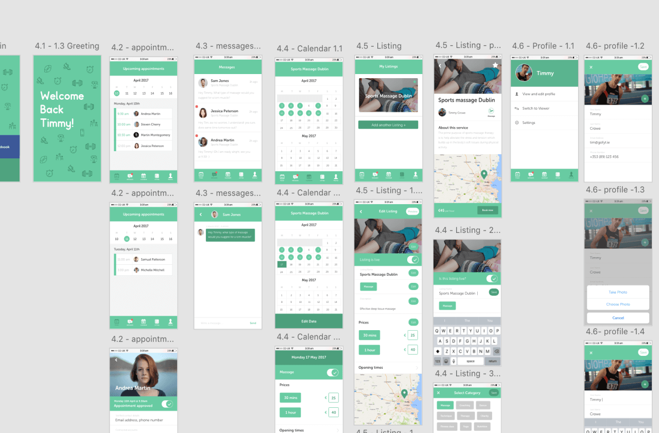
Hi-fidelity Screens
Working with the team to choose colour schemes, fonts, imagery style, icons transitions and company ethos informed the high-fidelity screens evolving how they looked and felt.
User Testing / ongoing progress
Working with the team to choose colour schemes, fonts, imagery style, icons transitions and company ethos informed the high-fidelity screens evolving how they looked and felt.
Building momentum with smart iterations
Gofyt had launched and gained substantial interest. We were processing a few hundred bookings per week and generating a growing revenue. However, this came with it’s share of curve balls, new clients lead to new platform challenges.
We catered for personal trainers, group trainers, nutritionists, physiotherapists just to name a few, each with their own specifics ways of doing business. The more we talked to each service provider, the more we understood how to tweak, re-purpose and as a last resort build a new feature to meet their needs.
The platform also had it’s share of growing pains, numerous unforeseen bugs, and the challenge of how adding a substantial feature would fit in the UX/UI ecosystem. We had to work quickly and efficiently to keep buyers and sellers happy. Bolstering business, selling and keeping with the platform design language were the difference between sucess in failure.

Taking bookings to new levels
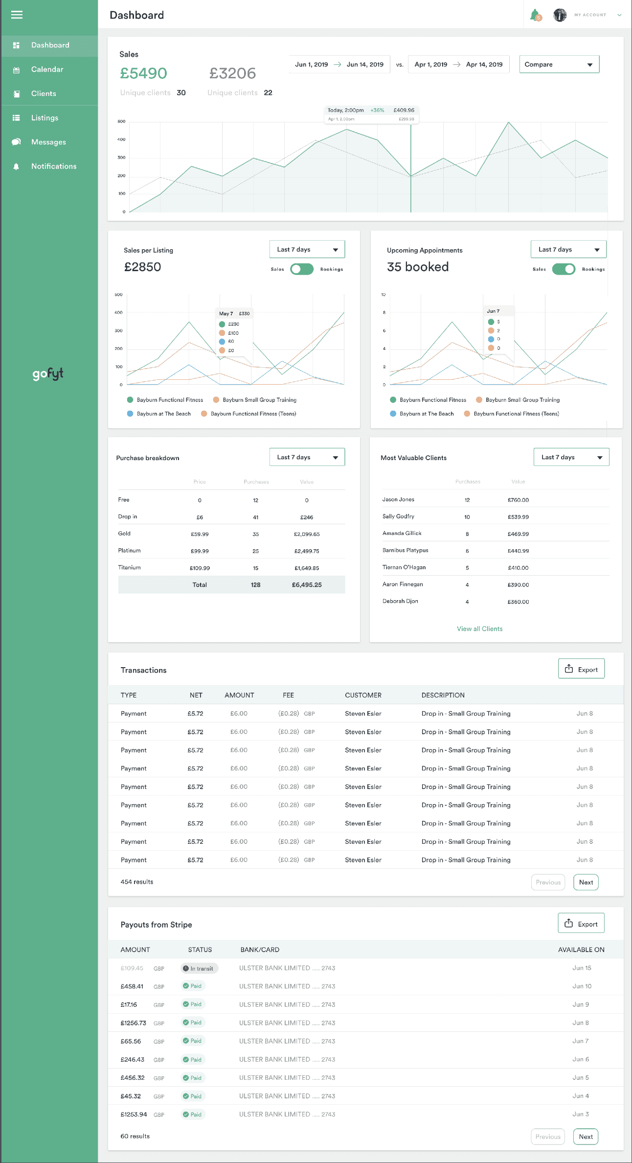
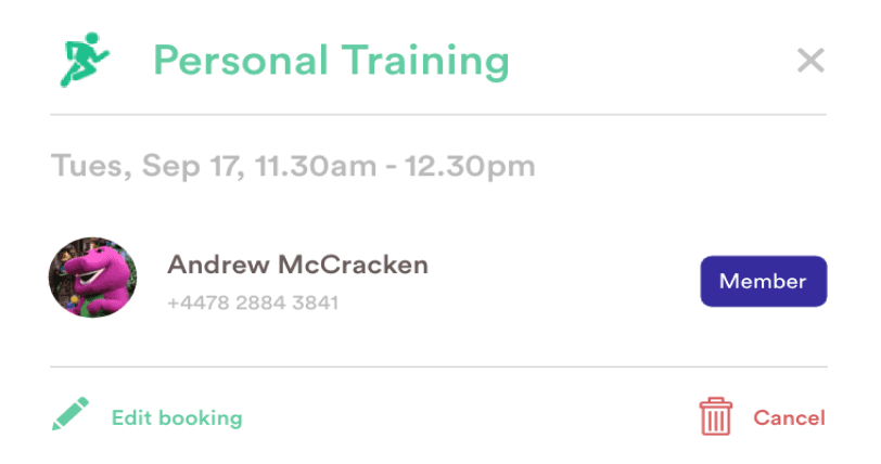
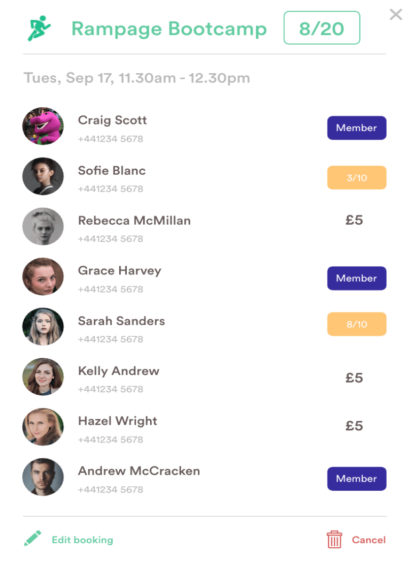
item 1 shows the first iteration of the dashboard, this was a starting point, talking to different sellers highlighted things that bore importance.
Things like appointment time, potential earning, who booked in and the ability to call and message the client. However this fell short for a couple of simple reasons:

Key Feedback
Users thought the dashboard was too hard to look for the information they needed, the current iteration didn’t resemble a calendar.
Users wanted an easy way to create a new booking by clicking on an empty slot on the calendar
They desperately needed a way to take group bookings and see who had booked in
Users typically wanted to glance at their bookings for the day but also wanted to see a holistic view of the entire week.

Data driven changes to the homepage
A plethora of buyer feedback said the homepage was confusing, they didn’t know how to use the search and many of them couldn’t even find it (many of our buyers aren’t technical and just use the platform need to find a physio and massage therapy).
This was quite a straight forward fix, I redesigned the homepage with the search bar front and centre, making it clear and obvious the search bar was to be interacted with. I also focused on making the search smarter.
The first home page only allowed users to search location, the second iteration search includes both location AND service, reducing two more clicks on the search results page.

This simple yet effective change increased clickthrough rates and time spent on the results page by 300%.
Streamlining Signup
Early on in the companies life we naively created a single user journey, this was to get the platform to a viable MVP stage and because we still needed to further validate the business model. I always had the sneaking suspicion we would need to revisit this as we grew.
I looked at other companies and in the essence of time, I gleaned from AirBnb and how they signed up people specifically their listers, at the time they had an intricate multi-step process as a once and for all approach, their assumption was that the seller would never need to anything more to add to or setup their profile etc.
I took this approach initially, as the platform was in it’s infancy the UI/UX wasn’t as smooth as I foresaw due to budget and time constraints. The reason for the long signup was to capture as much information as possible and help lead the seller by the hand to setup their listing, 70% of our sellers were not technical and couldn’t do it by themselves.
We focused on the following areas:
General Information
Working Hours
Listing Detail
Pricing / Offers
Location
Qualifications
Payment Details
Listers liked being led by the hand, overwhelming feedback however simply stated the process was too laborious. Quite a few organic sellers that tried to sign-up weren’t comfortable with entering their card details before they trialed the service. This led significant drop off rates and because it was at the end of the listing sign up the listing wasn’t submitted and was lost.
The solution came with reducing the sign up to a one-page basic information capture and giving a 30 day trail. We employed two customer success managers to hold the sellers by the hand educating them on the platform and helping them create their profile and listings. In the first month of this approach we
quadruped new listings and sellers.

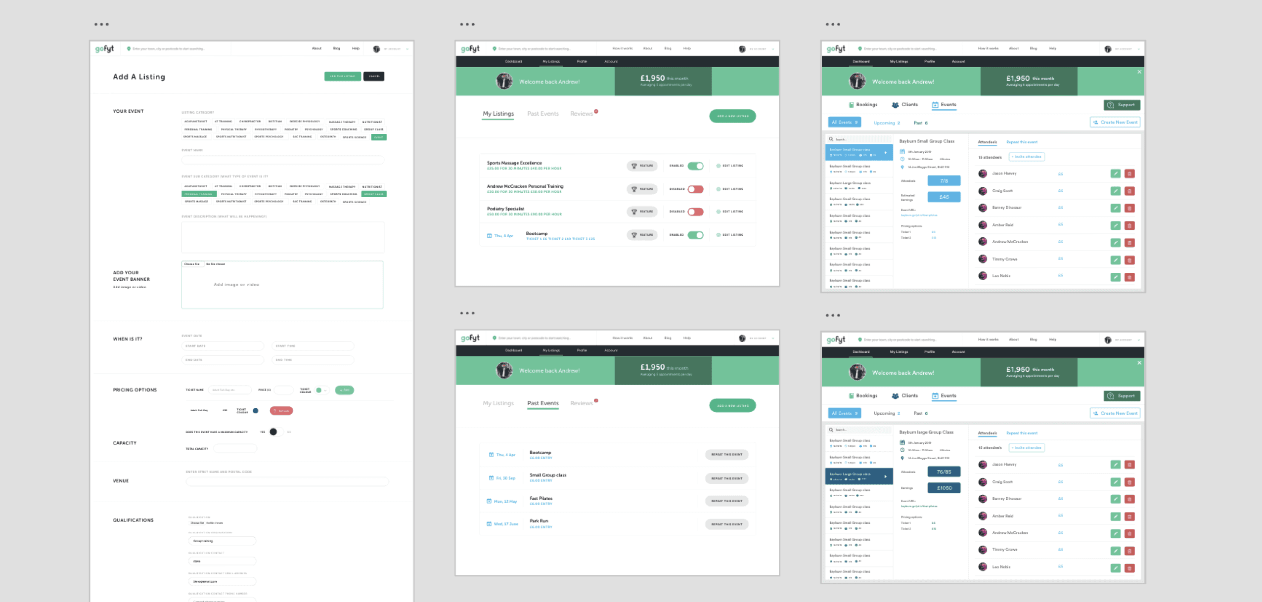
Events Page
A problem that arose quite often were sellers frustrations that they couldn’t do an offer, or a one-of booking or listing for a specific period of time. around 45% of the sellers performed bootcamps, meet-ups and seminars. They tried to make it work with the current listing page but it was fiddly, buyers (clients) kept getting lost and the entire UX was counterintuitive.
We didn’t have much budget left so I took note and added it to asana as a background task. When I had a few minutes I dipped in to think out the most natural UX. I created an InVision board of pre-existing methods for inspiration. Slowly but surely the UX percolated and an idea was ready to test with a few sellers. After trial and error and going through a couple of revision V1 was ready to build and test.
Most of the UI was repurposed which was handy so after the UX was ready the process was straight forward.
Testing with sellers proved positive as the UI was familiar to the pre-existing seller pages and so it was quickly adopted.
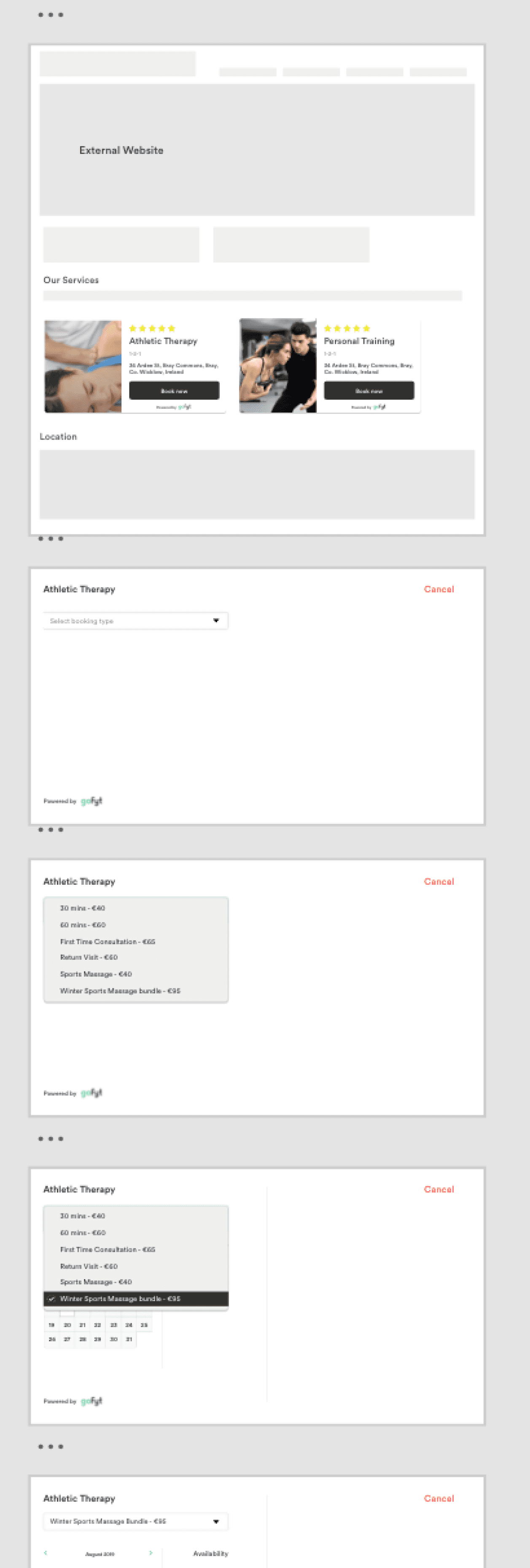
Booking Widget
The platform was stable and maintaining decent month on month growth. There were a large percentage of prospective sellers teetering on the fringes that couldn’t take the plunge to join the platform. The reason? they didn’t want to use the custom URL or the listing pages because they had already spend countless £1000’s building their own websites and platforms.
They loved the platform and the idea of generating organic
clients and managing all aspects of their business hooked them in. The solution was simple, create a simple plug-in booking engine for their personal websites that would allow their clients etc. to book through their site but still be tracked by gofyt.
I took to InVision and created a list of inspiration, looking at pre-existing solutions and created a couple of wireframes. I had a few coffees and showed the prospective listers our plans, needless to say they were keen and even willing to sign a waver that they would join if we built this into the platform (this helped justify the price with our investors.
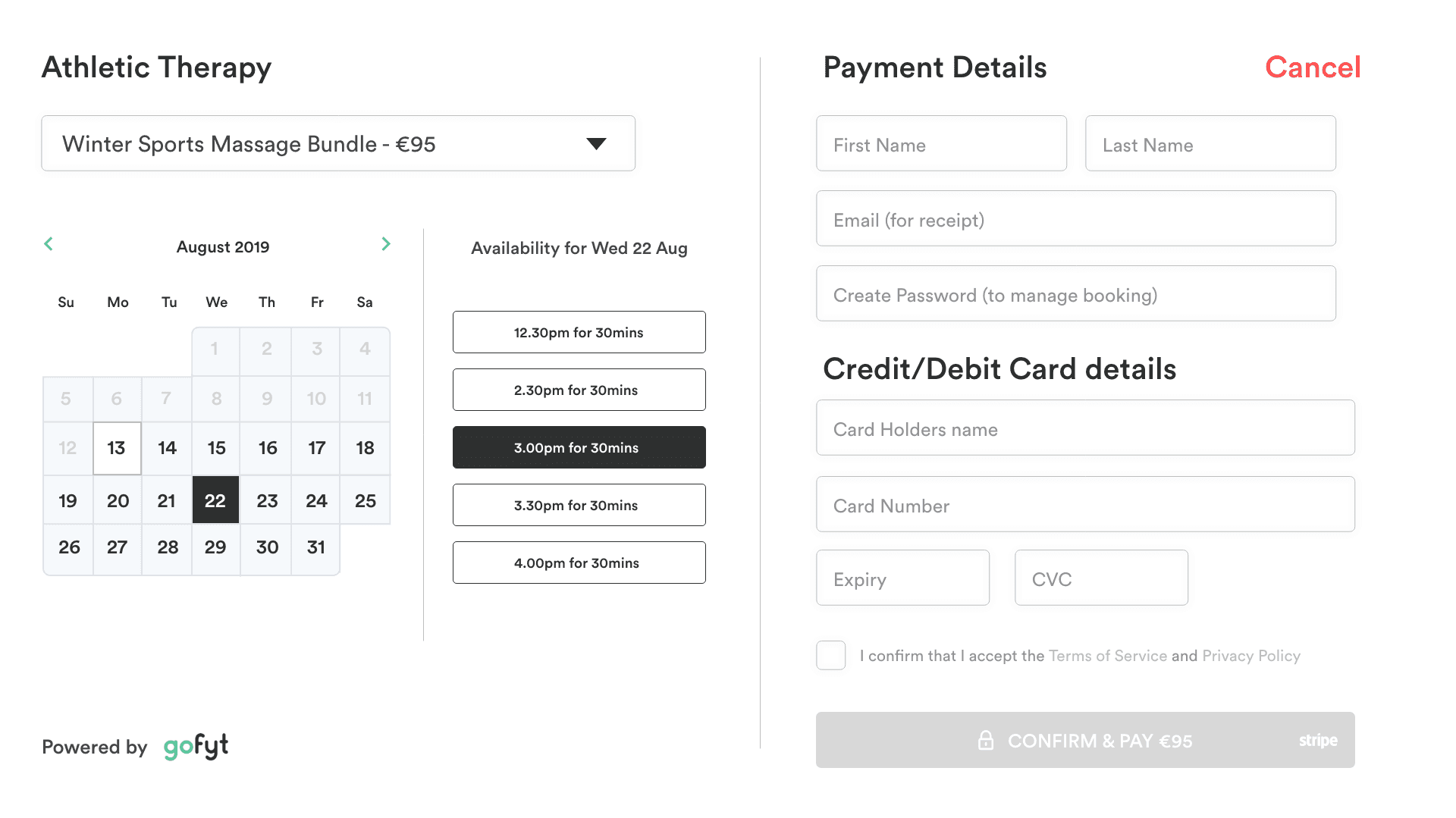
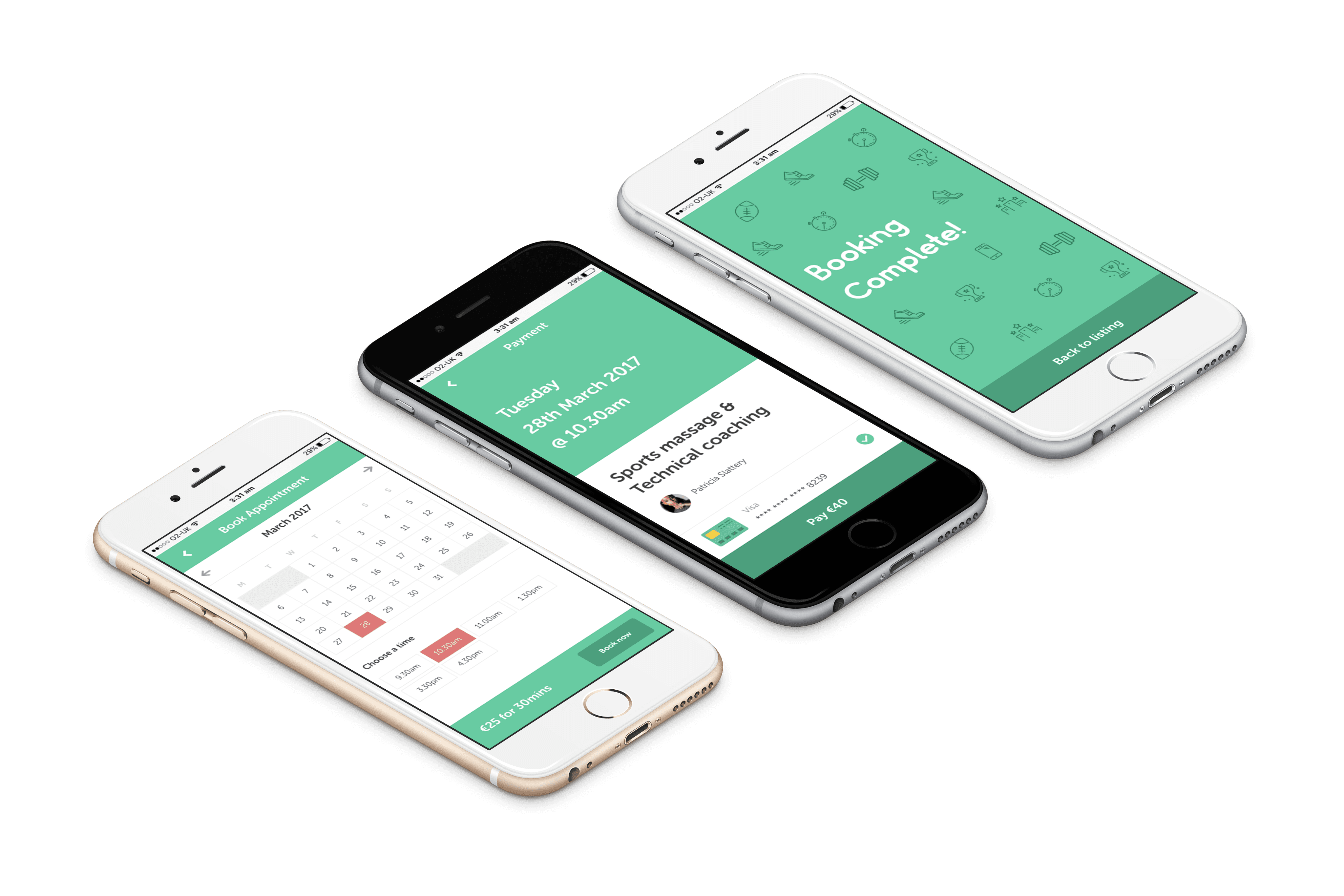
A few iterations later and the UI was ready to send to the dev team. The booking widget was simple to use, full screen and took the user through the following steps:
1
Choose booking type
2
Choose date & time
3
Add payment details and complete booking
This was the last feature build I completed before the company was acquired. I absolutely loved building gofyt and leading the team. I count it as my career highlight to date.
Exciting products expertly delivered
From consultant to head of design, going from Zero-to-one multiple times. Growing products to 1000’s of users, seeing growth of millions in revenue and saving teams thousands of hours.
© 2024 ANDREW MCCRACKEN.