
Fast tracking growth at the UK’s fastest growing music marketplace
UX Research
Strategy
Prototyping
Brand Guidelines
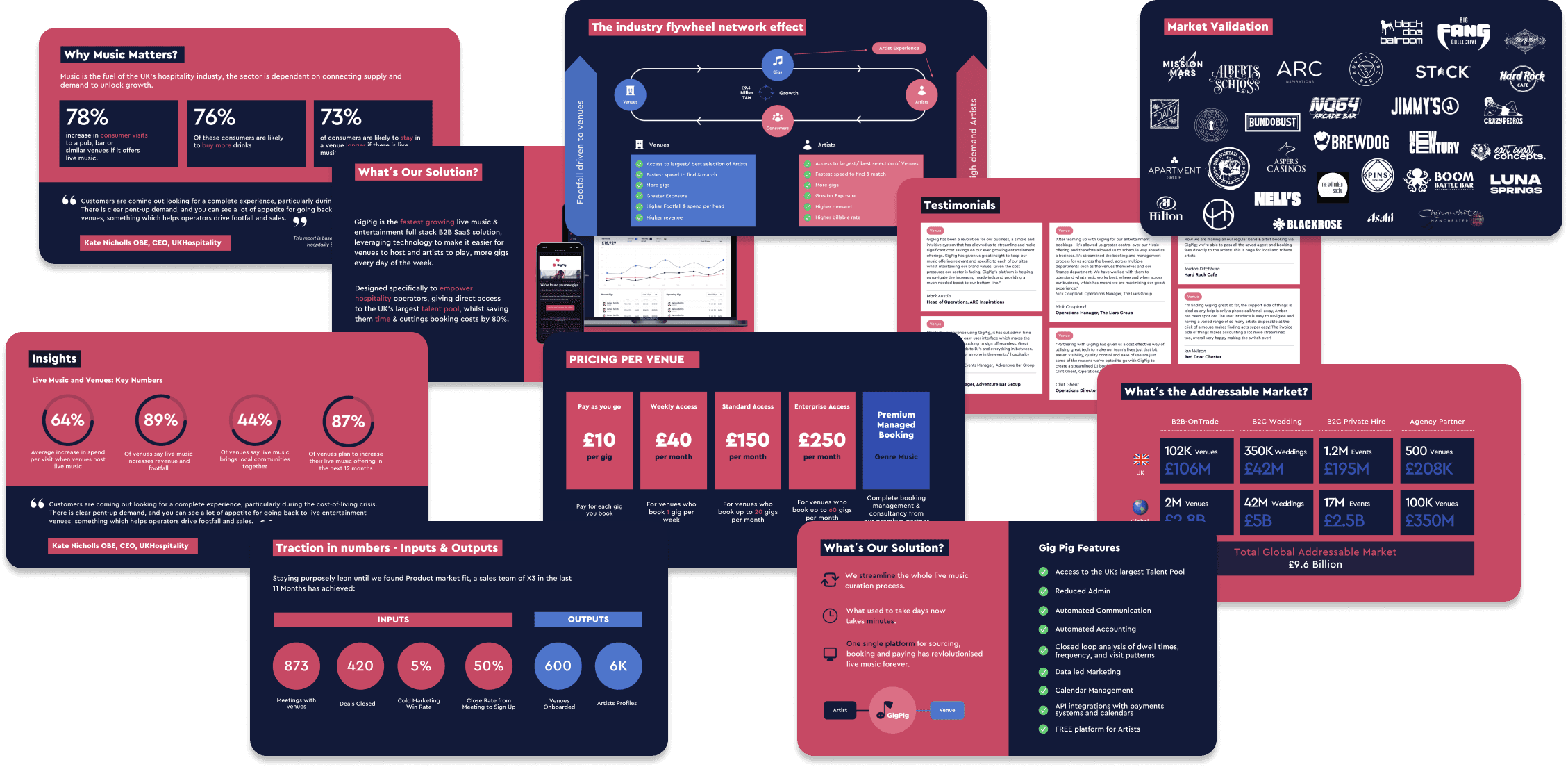
Pitch Decks
User Testing
UX/UI
Design System
Creative Direction
ABOUT THE COMPANY
GigPig is the UK’s fastest growing live music marketplace and is built to be an artist's and a music booker's best friend.
By leveraging the power of technology we make it easier for venues to host and artists to play, more gigs every day of the week.
Gigpigs purpose-built platform gives bookers and venue managers unparalleled access to thousands of verified local artists, with all the tools they need to seamlessly book and manage live music.
While offering artists a free platform to find, play and get paid for gigs, with complete control over when, where and how much they are paid. By transforming the way the industry discovers and books artists, GigPig is helping bring live music to every street corner in the UK.


SUMMARY
Problem
Gigpig was experiencing a few teething problems, they didn't have in-house design expertise & the UX of their platform needed work, this made an impact on investors stalling as they couldn't 'see' product progression.
Current product design was stalling investors
All user journeys were the same for different users
Benefits of platform not clear - user drop off
No design system - dev's inefficient
No brand guidelines
Current site had low conversion rate
Goal
Scale fast to recognised as the UK’s leading music marketplace and grow to become Europes leading music marketplace.
Collaborating closely with the CEO, CTO & Head of Product I lead the design in the following areas:
- Design Management (sprint planning and weekly reviews)
- Brand guidelines
- Pitch decks
- Design system
- End-to-end product redesign
- Website design
- UX analysis (flows and persona)
- Usability Efficiency (Heuristic Reviews)
- Lo-fi prototyping (basic flow and interactions)
Gigs booked per week grew by 500%
Weekly Artist signups grew by 400%
Partnership agreement resulting in 160,000 more gigs per year
User engagement & retention increase
Gigpig successfully raised capital with the product redesign
Developers efficiency grew 300% with the design system
DETAILS
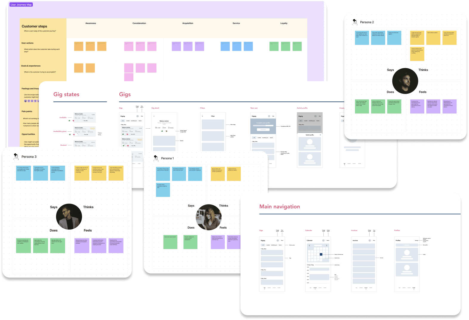
🔎 Identifying bottlenecks with UX Research
It's important to get really clear on identifying a 'North Star'. This is a direction every piece of research, design & feature release points to.
I spent some time with all the key people in the team to understand what they were working on. Specifically I spent time with the CEO, sales/Marketing, head of product & tech team. Asking probing questions about who the actual customers were, the customer acquisition process, sales cycle & attrition rates.
User Interviews
You would be surprised what getting one-on-one conversations with users can do.
I carried out a few interviews with different customers, understood their pain points, what what frustrating for them when it comes to booking music and generally getting an insight into their current experience.
Uncovered key pain points and frustrations
Surveys
We used some gave the users an incentive (free bookings) to fill out questionnaires.
This was great for gathering a broader data from a range of different customers (Venues & artists)
Gathered a broad understanding from a wide range of users
Feature Stacking
This is a game changing technique and makes it clear very quickly what matters to the user.
Effectively all you do it ask the user to prioritise a stack of features (current & upcoming) and reorder them in terms of priority according to them.
Gathered a broad understanding from a wide range of users
Personas, empathy paths & key user journeys per product
I worked with the marketing & sales teams to get really clear on who the customers actually were, what their roles are what's important to them, the problems they face with booking gigs. This helped form a jigsaw of who key decision makers are and how to help them.

Helping uncover markers for success
This keeps the feedback loop tight and maintains good communication with customers
It reinforces the teams efforts towards our goals
It highlights bugs/problem areas and what is working from every product release
It removes any assumptions we have, we get fresh outside perspective on releases
Brand Guidelines
1
Brand Consistency
The main reason we needed to create guidelines was to ensure that all communications and designs adhere to the brand's visual identity, voice, and tone, reinforcing brand recognition and trust.
2
Clarity & Efficiency
They also provide clear instructions on how to use brand elements, such as logos, colours, typography, and imagery, streamlining the design process and reducing ambiguity.
3
Brand Protection
We need to protect the brand in our quest to be the most recognisable music marketplace in the UK.
4
Unified Brand Experience
The guidelines enabled us to stay consistent across the board to make for a more cohesive and memorable experience for customers, strengthening brand loyalty and differentiation in the market.

Pitch Decks
Marketing material
Investor decks
Partnerships
Investor updates
Planning & strategy
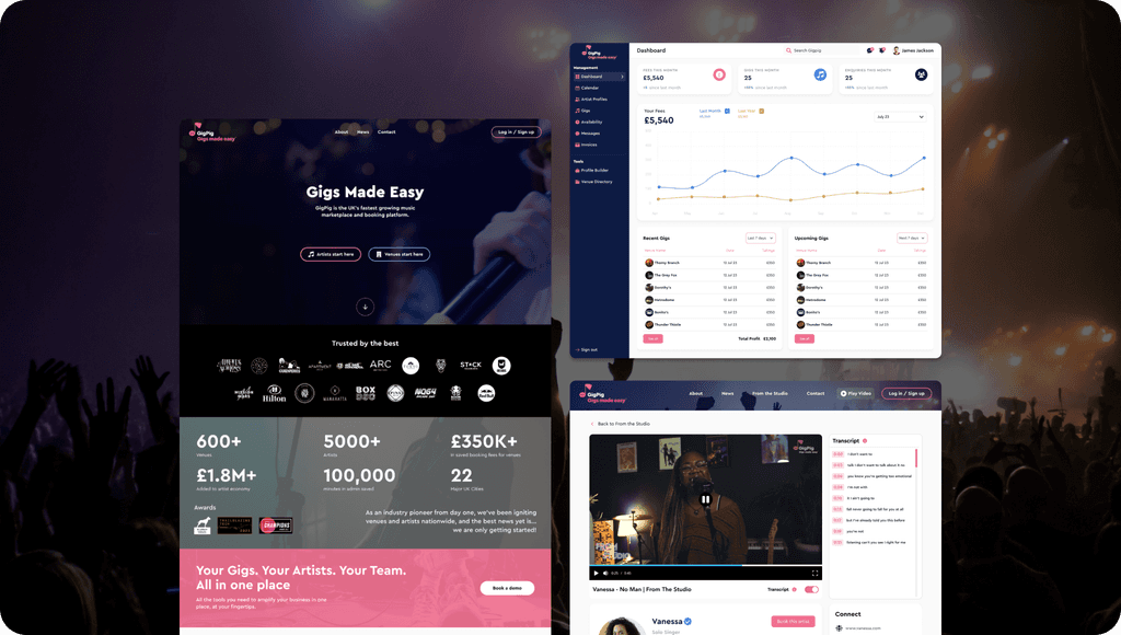
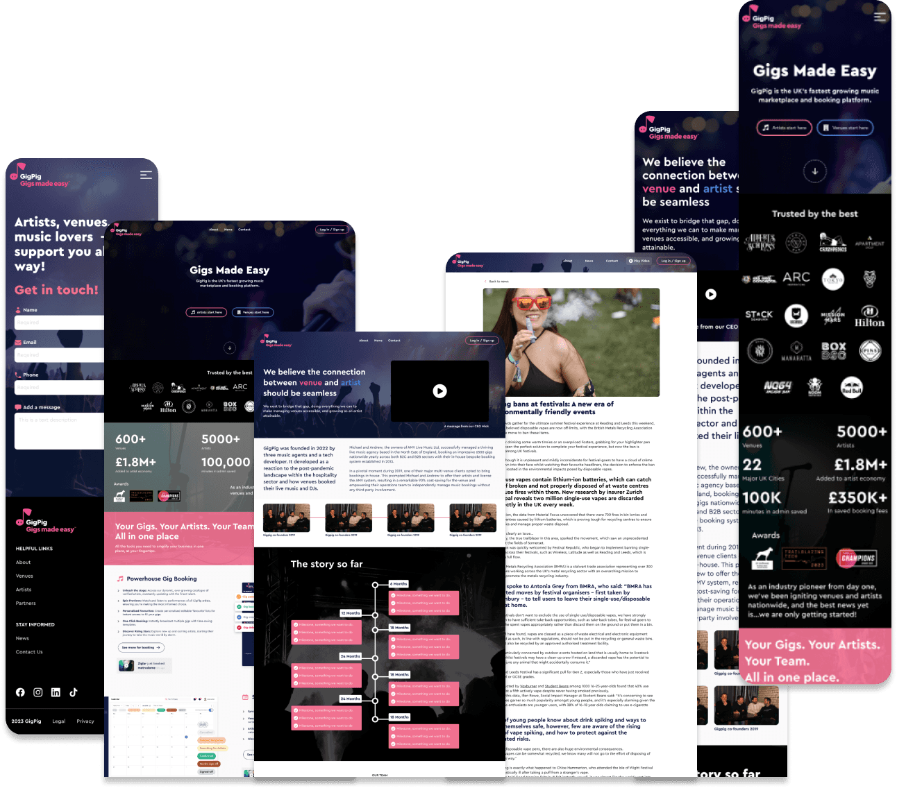
Website Redesign
I suggested we redesign the current web experience, we needed to create a more engaging experience and position us above competitors. There are quite a few competitors in this space that have nice 'salesy' websites but nothing meaningful behind it, Gigpig is the superior platform and needed a site to reflect that.
1
Improved User Experience
Redesigning the web experience was key to make subtle enhancements in navigation, layout, and functionality.
2
Increased Conversion Rates
Being laser focused on good UX and clear call-to-actions this redesign raised the bar on user engagement & retention rates.
3
Strengthened Brand Identity
This redesign was key for brand alignment provides, ensuring consistency and relevance with the brand's identity, messaging, and values.
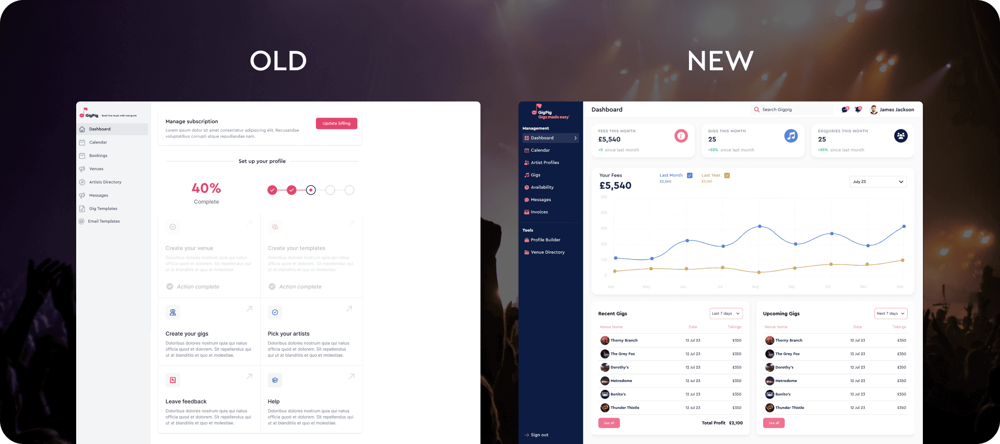
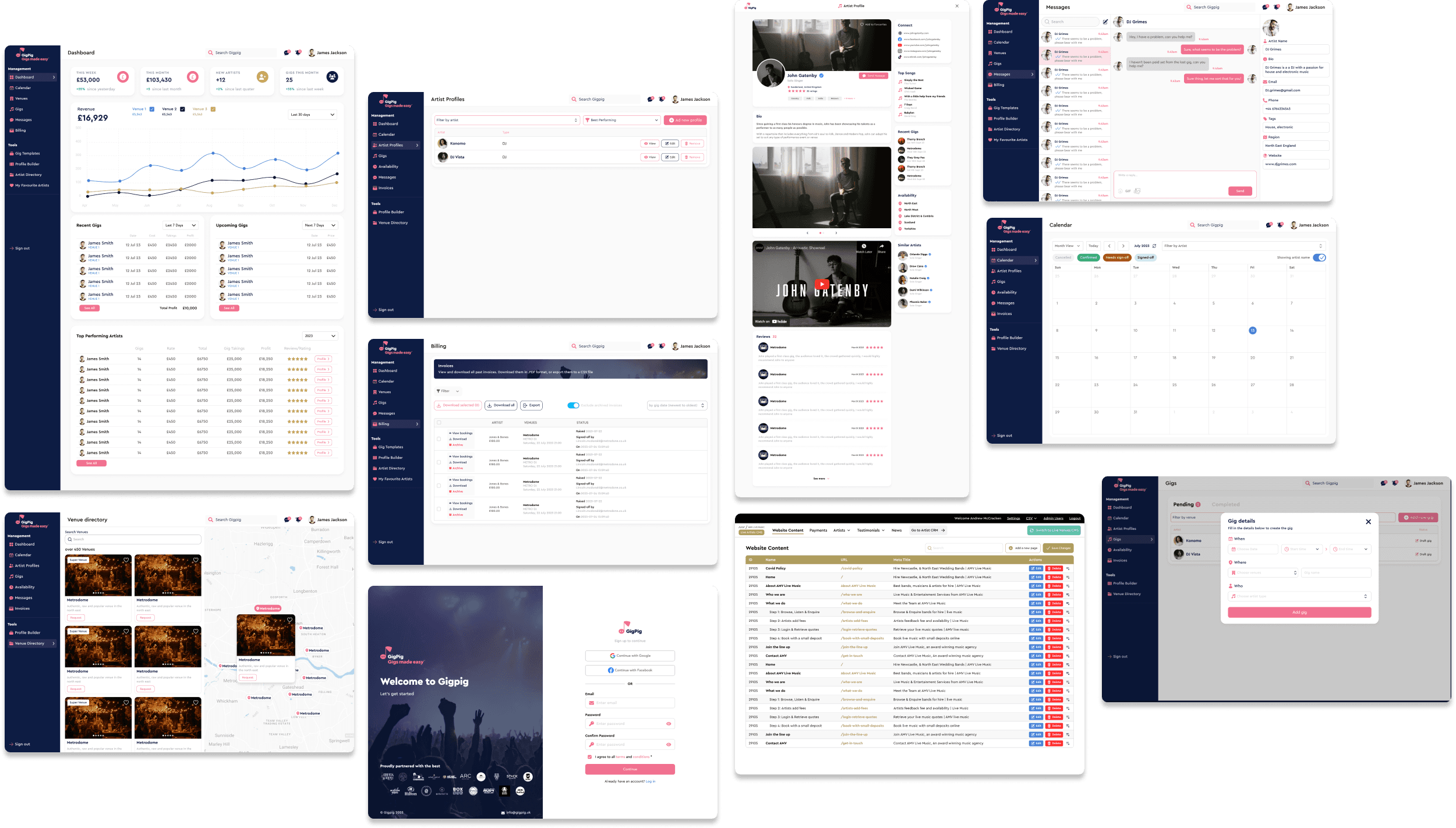
🧩 Creating a design system that speeds up development
Outcome - a relatively simple 4 level approach
Working with the dev team, understanding how the existing components worked and working with them to create a system that was easy to use and quick to build variations of existing screens.
🎨 30+
Styles
🧩 40+
General
Components
👨👩👧👦 10+
Team users
✅ 200%
Increase in
efficiency

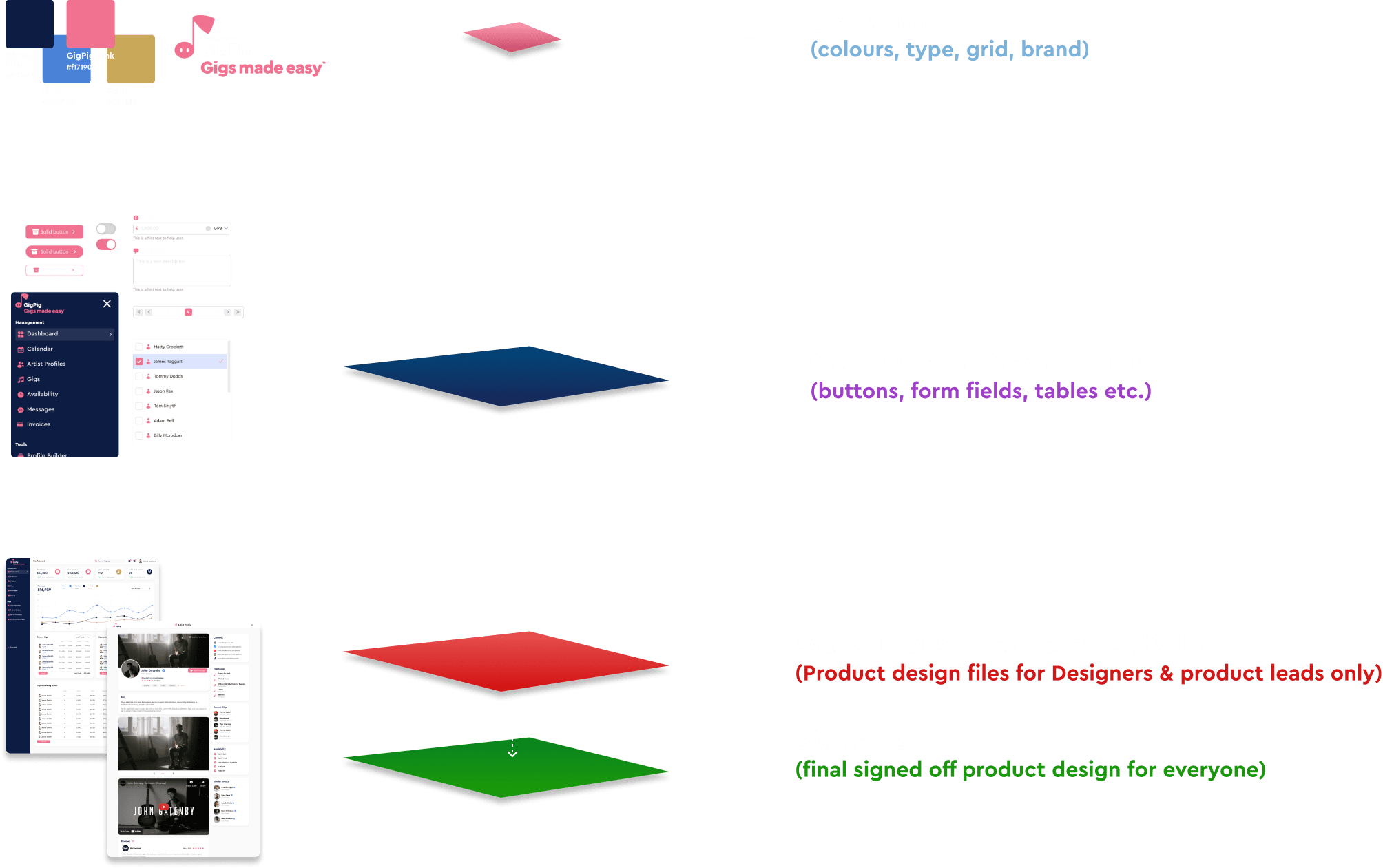
🎨 Style guide
Colours - Assigning primary & secondary colours
Typography - H tags, paragraphs, forms & button font weights and sizes
Grid - Implementing a grid system that informed everything
*Adding colour, type and grid styles for each products sped up dev time considerably

🧩 General Component Library
Icons, buttons, inputs, drop downs, tables, pagination, tabs, avatars & much more
Each component had a base level, which could be easily adapted and changed
All built with auto layout
Powered by our built in colour, typography styles & grid setup

🔴 ‘WIP (work in progress)’ & ‘Signed off’ Product design
🔴 WIP
This grants the designers and product leads complete flexibility to work at files without anyone else seeing them.
Including WIP files across the product suite was an important iterative step.
Due to the fast pace of delivering design designers and developers were working on the same page which led to confusion as to which part was signed off.
✅ ‘Signed Off’
This was the final version version shared with everyone on the team.
This worked great as it reduced any confusion from before, the devs and other product managers knew exactly what they were looking at.
How it worked
When all the screens were finalised on the WIP, we made them Figma components and pushed them to the ‘signed off’ files. This kept the shipped design clean.
It also made it incredibly easy to whip up new versions and variations.

Gofyt: book fitness anywhere
A comprehensive walkthrough of starting, building & selling my first startup
© 2024 ANDREW MCCRACKEN.