
How I helped MPS Data design, build and ship their data Analytic products
UX Research
Strategy
Prototyping
User Testing
Branding
UX/UI
Design System
Creative Direction
Leadership

ABOUT THE COMPANY
Leading the charge on Sports analytics
Founded in 2019, having evolved from a successful sports betting syndicate, MPS Data now operates a portfolio of products across professional sport, amateur sport and sports betting.
MPS specialise in providing robust algorithmic modelling of subjective and objective data analysis within open-skill, team sports.
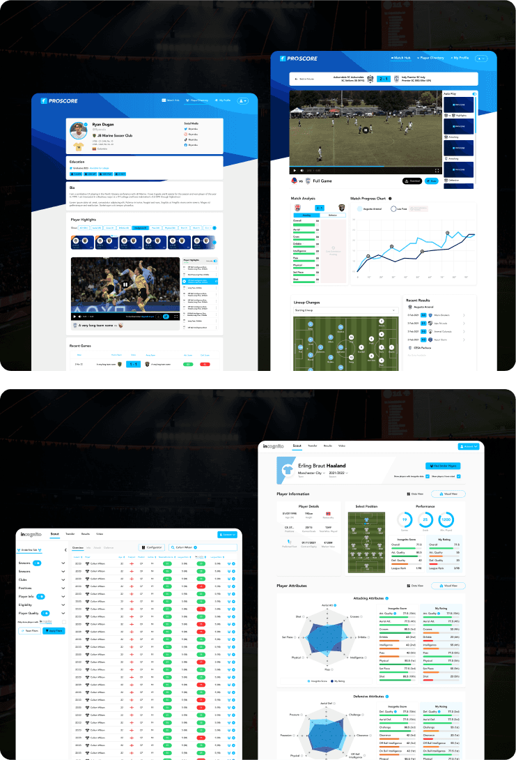
Product Suite

Professional football analytics in Europe
- 50+ screens
-Admin Application
-10,000 players analysed
-Dedicated team of 20
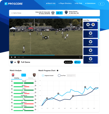
Youth Soccer Analytics in the US
-Partnered with MLS
-50+ screens
-Admin Application
-Mobile App
-Dedicated team of 30
-10,000+ users
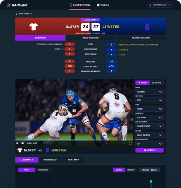
Professional Rugby Analytics in Europe
-Partnered with multiple clubs
-30+ screens
-Admin application
-Dedicated team of 10
SUMMARY
Problem
MPS saw rapid growth and interest in early product validation, but with momentum comes it’s share of challenges:
Issues within the MPS team
Buggy platforms
No design system
10 products with no structure
Design team - different levels
A lot of work to do quickly
Limited runway
No clear brand
No user feedback loops
Dev teams work doesn't match design
Customer issues
Growing Customer base
Bugs - frustrating UX
Products - too hard to use & data heavy
Don't like current platform design
Goal
Be the world leading provider of performance data and video content in amateur and professional sports. Harnessing the power of data and video to deliver the next generation of sports analysis and engagement tools.
Collaborating closely with the CEO and head of product I lead the design in the following areas:
The Outcome
Customers felt listened to when their feedback was implemented
We built and released over 10 applications
Design system implementation sped up development output by 300%
Bugs decreased and product alignment increased
Products grew from <100 to 10,000+ customers
The collaborative design input added to a Series A raise
DETAILS
🔎 Identifying bottlenecks with UX Research
I Introduced quarterly UX Reviews of current products
I divided this up among the team for a collaborated effort
This gave us a good general oversight on the current condition of each products
It uncovered problem areas in design and build quality
It uncovered pain points for customers and for the business

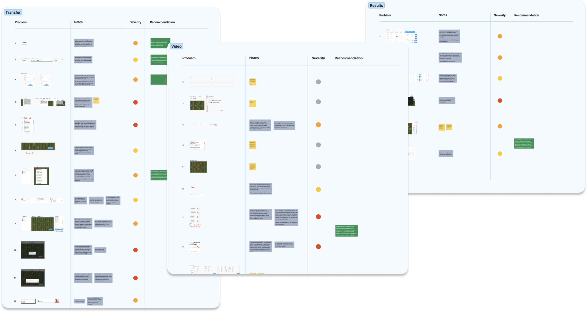
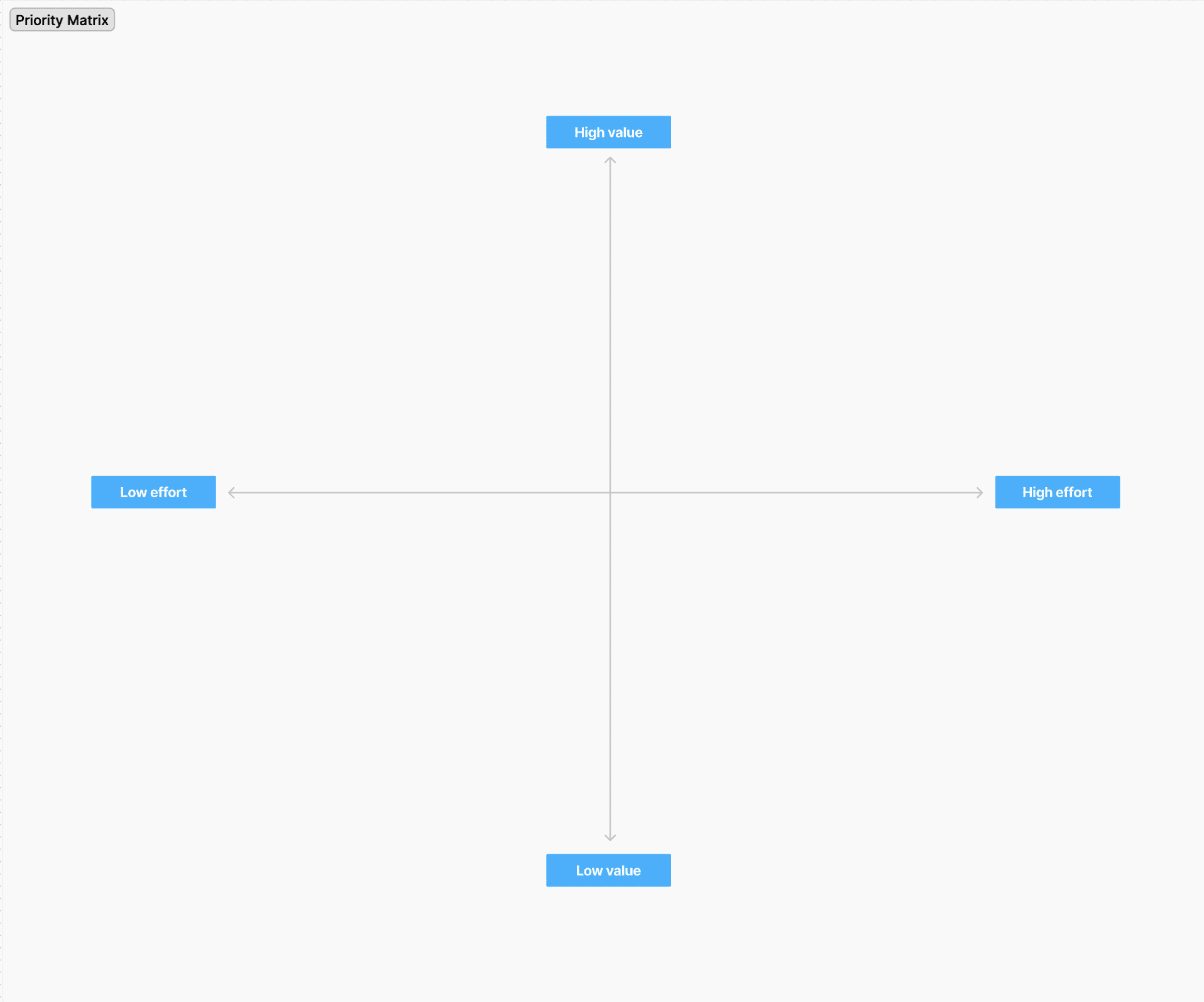
Using a priority matrix
High priority / low effort
This is key for establishing critical next steps
It acts as a north star to align the team
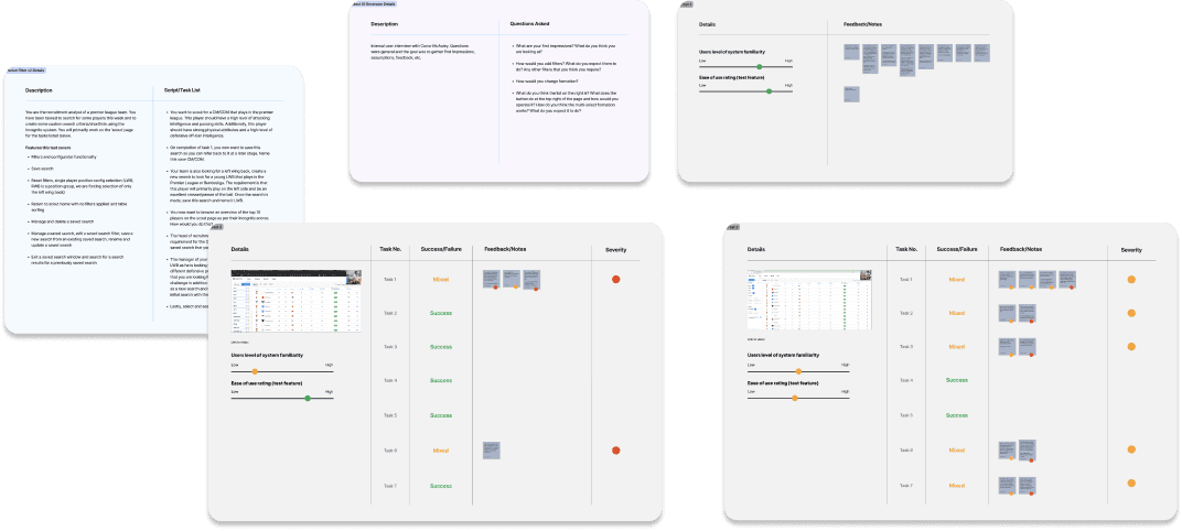
Setting up routine user testing & feedback loops
This keeps the feedback loop tight and maintains good communication with customers
It reinforces the teams efforts toward our goals
It highlights bugs/problem areas and what is working from every product release
It removes any assumptions we have, we get fresh outside perspective on releases

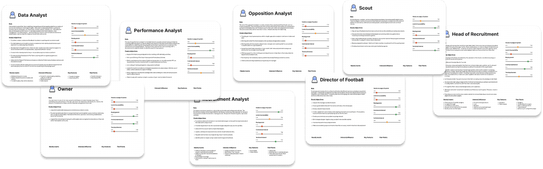
Personas, empathy paths & key user journeys per product
Working with the sales team and carried out customer interviews to establish user research, competitive analysis and a range of research for each product, their needs and pain points.
🧩 Creating a design system that skyrocketed productivity
🚫 Design system challenges to overcome
It needed to service 10 products
It needed to serve components to a dev team of 50+
It needed to be able to version control
It had to sync together to allow quick prototying new screens
It needed to be simple enough for onbaording new members of the team
Outcome - a 5 level approach
After 12 months of trial and error, the most efficient version of the design system had five levels:
🎨 50+
Styles
🧩 60+
General
Components
⚽️ 40+
Product specific
components
👨👩👧👦 60+
Team users
✅ 300%
Increase in
efficiency

Evolving over time
After a lot of trial and error, test scenarios, time tests, and team wide sessions where we assessed efficiency we honed the design system into the cleanest structure.


🎨 Style guide
Colours - assigning primary & secondary colours
Typography - H tags, paragraphs, forms & button font weights and sizes
Grid - Implementing a grid system that informed everything
*Adding colour, type and grid styles for each products sped up dev time considerably

🧩 General Component Library
Icons, buttons, inputs, drop downs, tables, pagination, tabs, avatars & much more
Each component had a base level, which could be easily adapted and changed
Powered by our built in colour, typography styles & grid setup
All built with auto layout
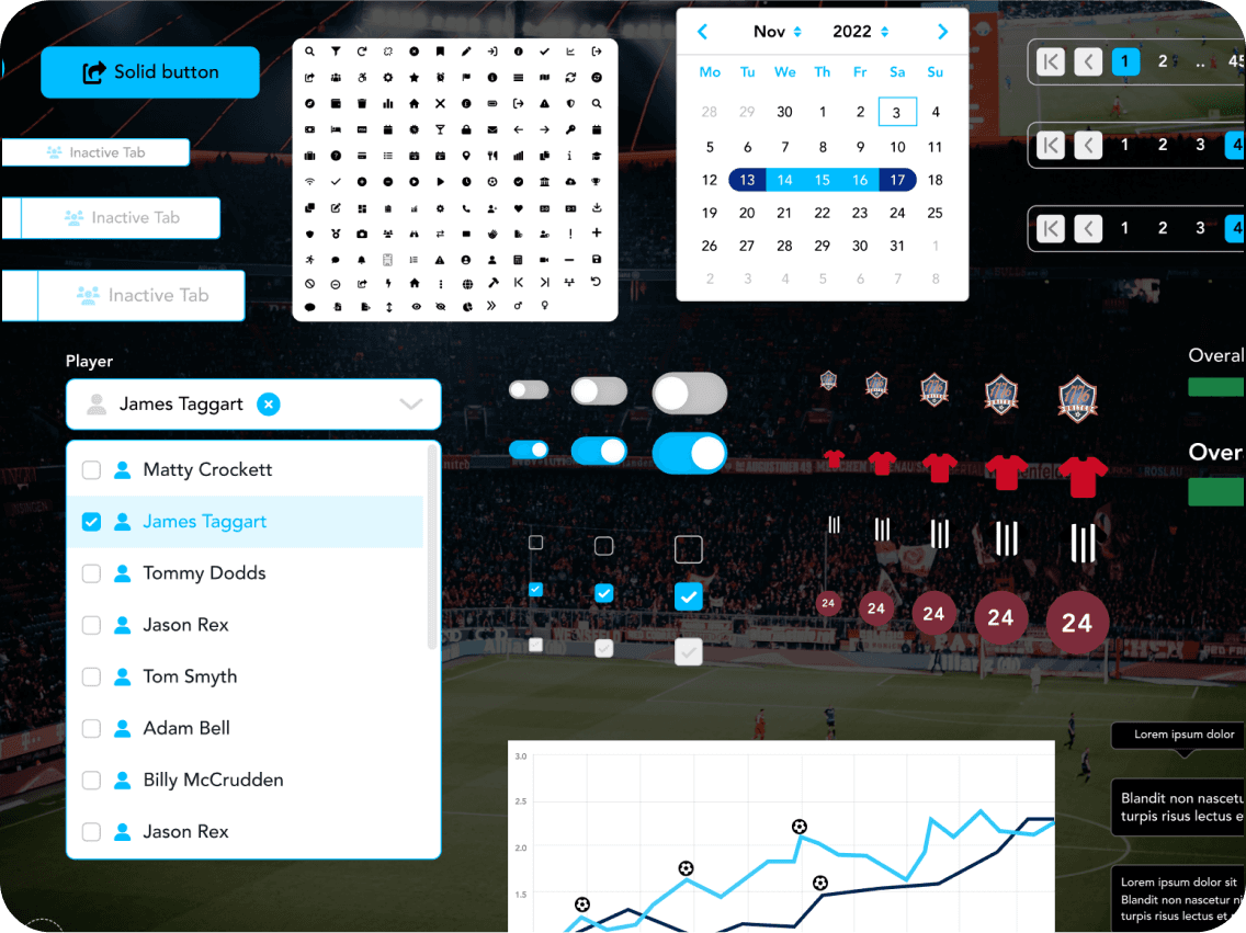

⚽️ Product Specific Component Libraries
Navigation, pitches, popups, cards, sections, avatars, tables & much more
3 main products each had their own specific library
Each component synced with their respective general component
This approach gave us the flexibility to give each product a unique style whilst being governed by the same general components
🔴 ‘WIP (work in progress)’ & ‘Signed off’ Product design
🔴 WIP
This grants the designers and product leads complete flexibility to work at files without anyone else seeing them.
Including WIP files across the product suite was an important iterative step.
Due to the fast pace of delivering design designers and developers were working on the same page which led to confusion as to which part was signed off.
✅ ‘Signed Off’
This was the final version version shared with everyone on the team.
This worked great as it reduced any confusion from before, the devs and other product managers knew exactly what they were looking at.
How it worked
When all the screens were finalised on the WIP, we made them Figma components and pushed them to the ‘signed off’ files. This kept the shipped design clean.
It also made it incredibly easy to whip up new versions and variations.
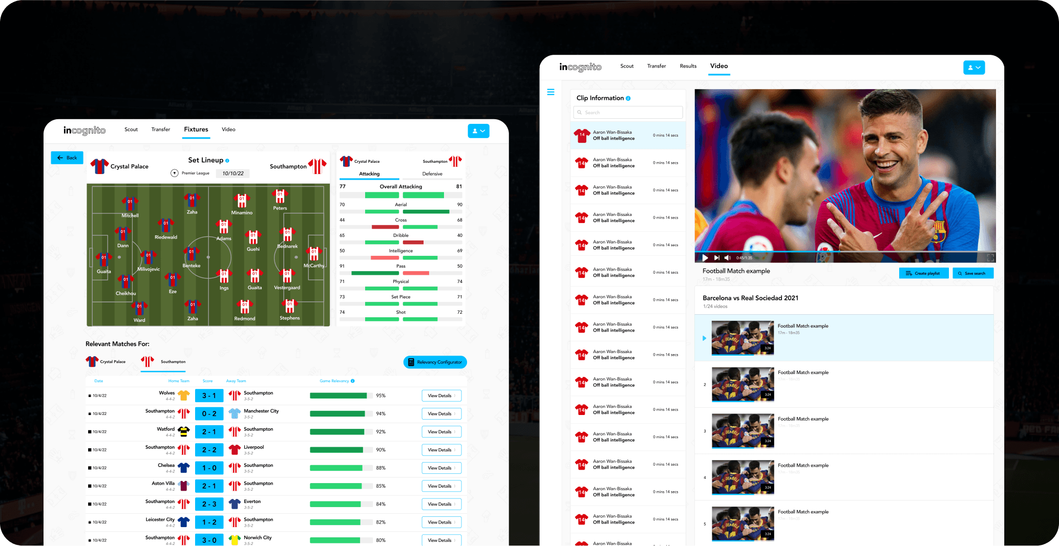
🎽 Case Study
Team Shirts

Throughout my time as head of design we took on various mini projects, this documents one of them.
Problem
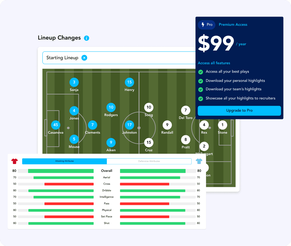
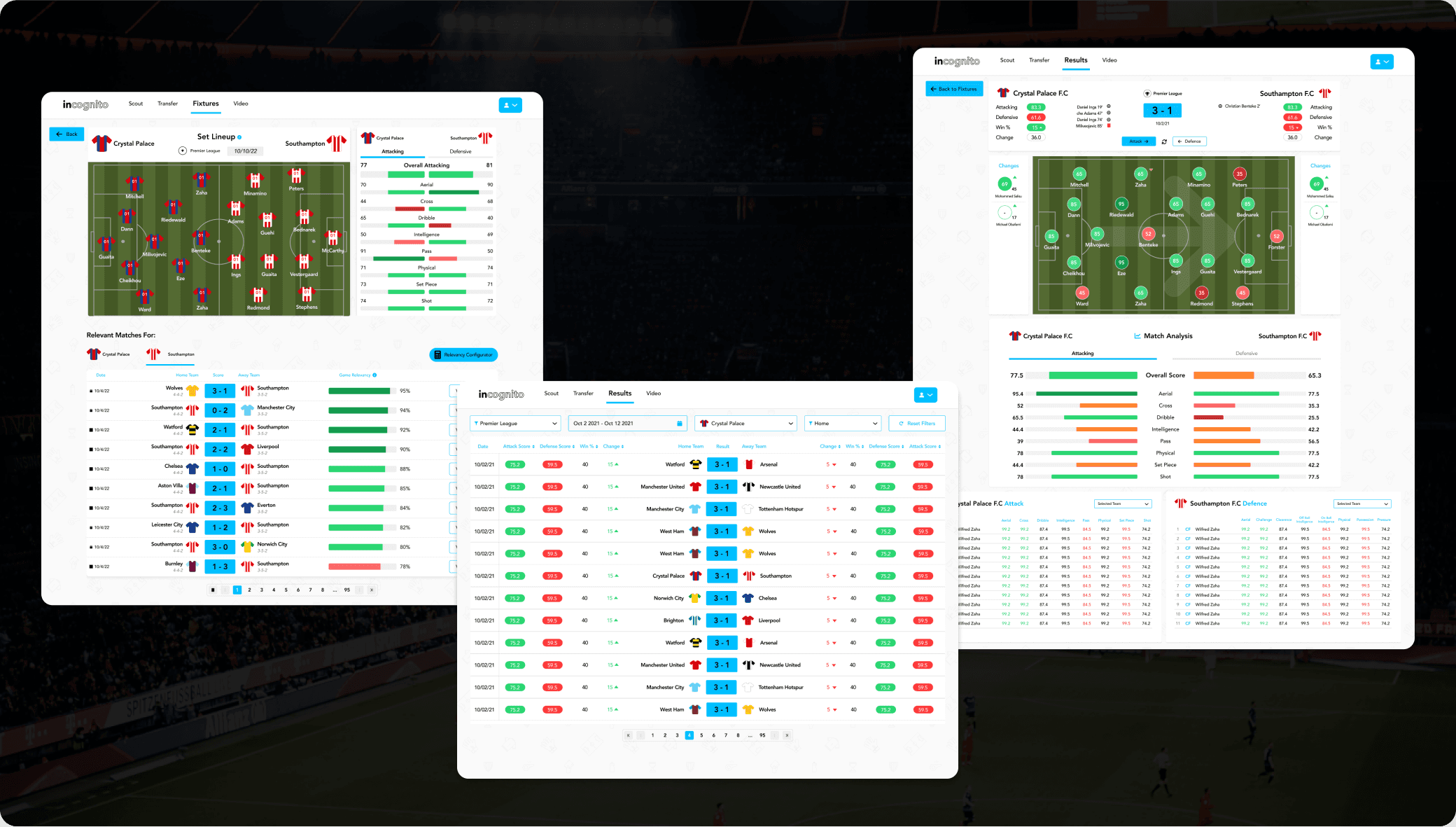
Incognito, the professional football solution is extremely data heavy, and feedback from users wasn’t good. They said the data was amazing, however, it incredibly hard to digest and follow the trends.
Pages and pages of data on games and players hard to follow
1000’s of game results hard to digest
10,000+ players anaylsed on over 100 metrics - DATA heavy
We couldn’t use club badges or player pictures (prohibited image rights)
Goal
Create shirts for all the professional football teams in 30+ leagues to break up the data and make the data trends easier to follow.
Built into the design system
Easily created and edited with templates
Need to be easy push these to designs & tables
Process
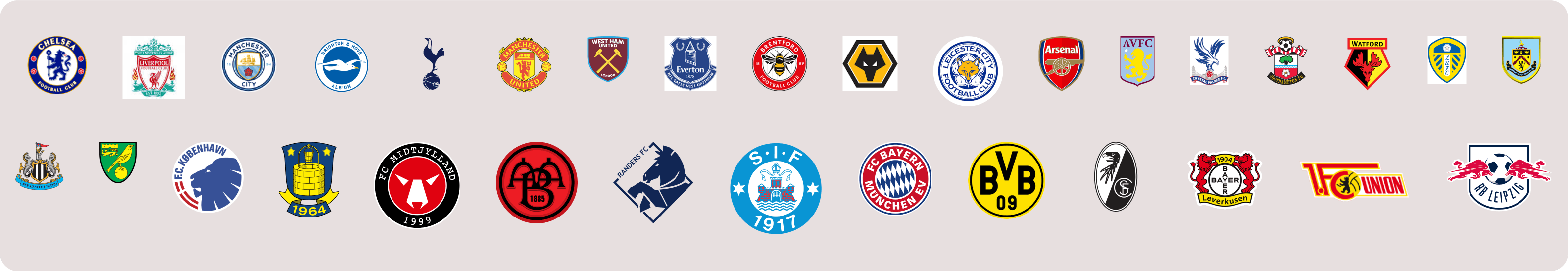
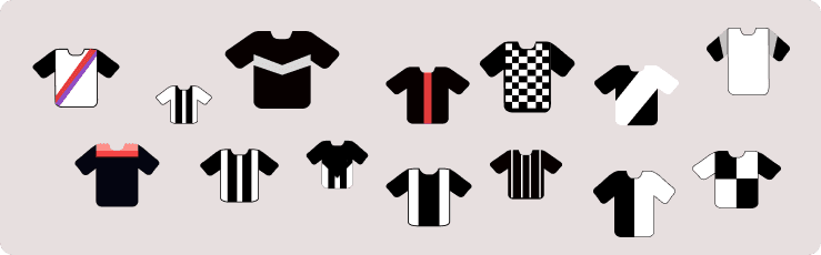
I researched every club in our data set and split them among the team, we got screenshots of club crests, colours and shirt designs. We researched over 600 professional teams
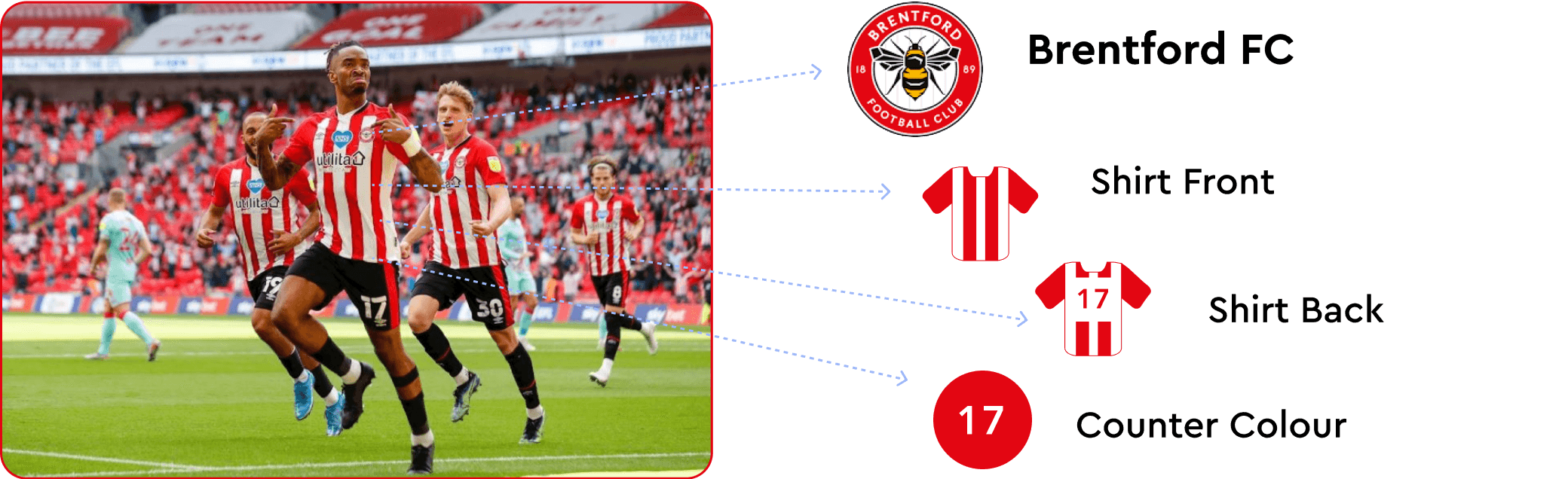
After the research phase we created a ton of templates covering all the different patterns, stripes and shapes of the club shirts. We had to re-create the shirt patterns in the simplest form so they would be clear on the platform. However, because the clubs themselves are the customers we made sure the shirts were easily identifiable.
Over 40+ templates created from research
Over 600 shirts created
They were completely scalable
We made them figma components
The templates made it really easy to create the team shirts, the process was:
Look at the club shirt
Find the closest template & use club colours
Create front of shirt, back of shirt and counter version
Repeat for all leagues
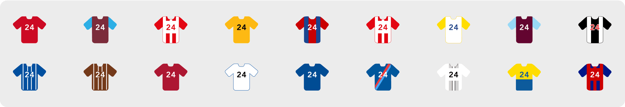
We divide the shirts into teams, then leagues and finally arranged them by countries
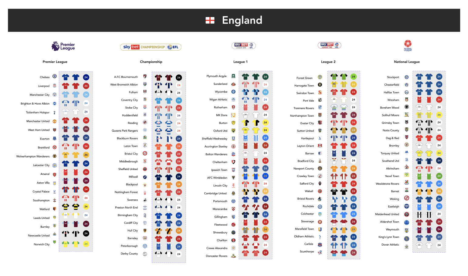
The final result made generating screens, demos, mock ups for selling a breeze.
Mini Project Outcome
The customers usability increased x10, it was much easier to digest large data pages
The shirts were adopted and reused in many other use cases throughout the products
The shirts didn't infringe on any image rights or players or clubs
Whilst simple design the teams and players remained identifiable
The investors loved the shirts

Gigpig: Book gigs get gigs
Fast tracking growth at the UK’s fastest growing music marketplace
© 2024 ANDREW MCCRACKEN.